Created by CyanHall.com
on 11/10/2020
, Last updated: 04/30/2021.
👉 Star me if it’s helpful.
 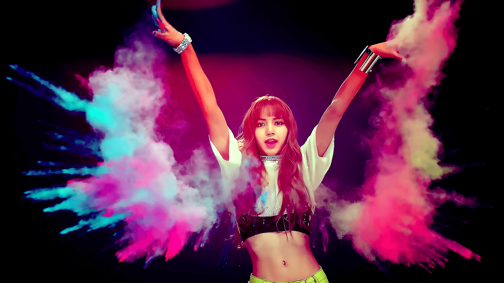 =>
=>
=>
=>
=>
=>
=>
=>
=>
=>
Use clippy to generate
=>
First, create a text above the
=>
LISA
And, set
LISA
=>
LISA
=>
=>
=>
More effect can be found on bennettfeely.com
* Sample Photo from LISA BLACKPINK - ddu-du ddu-du mv
👉
Star me if it’s helpful. 1. CSS Filter: brightness
filter: brightness(0.4);
=>
2. CSS Filter: grayscale
filter: grayscale(1);
=>
3. CSS Filter: opacity
filter: opacity(0.3);
=>
4. CSS Filter: blur
filter: blur(2px);
=>
5. CSS Filter: invert
filter: invert(1);
=>
6. clip-path
Use clippy to generate
clip-path clip-path: polygon(
50% 0%, 61% 35%,
98% 35%, 68% 57%,
79% 91%, 50% 70%,
21% 91%, 32% 57%,
2% 35%, 39% 35%
);
=>
7. mix-blend-mode
First, create a text above the
img <div style="position: relative">
<img src="sample.png"/>
<span style="
position: absolute;
top: 50%;left: 50%;
transform: translate(-50%, -50%);">
LISA
</span>
</div>
=>
LISA
mix-blend-mode:
    .span {
  mix-blend-mode: screen;
}
LISA
LISA
8. Ink Painting Effect
    .ink-effect {
  background-image: url(/sample.png);
  background-blend-mode: difference;
  background-position:
    calc(50% - 1px)
    calc(50% - 1px),
    calc(50% + 1px)
    calc(50% + 1px);
  filter: brightness(2) invert(1) grayscale(1);
  box-shadow: inset 0 0 0 1px black;
}
=>
9. Pencil Painting Effect
    .pencil-effect {
  background-image: url(/sample.png), url(/sample.png);
  background-blend-mode: difference;
  background-position:
    calc(50% - 1px)
    calc(50% - 1px),
    calc(50% + 1px)
    calc(50% + 1px);
  filter: brightness(2) invert(1) grayscale(1);
  box-shadow: inset 0 0 0 1px black;
}
=>
10. Colored Pencil Effect
    .colored-pencil-effect {
  position: relative;
  background-image: url(/sample.png);
  box-shadow: inset 0 0 0 1px black;
  background-size: contain;
}
.colored-pencil-effect:before, .colored-pencil-effect:after {
  display: block;
  content: "";
  position: absolute;
  top: 0;
  left: 0;
  right: 0;
  bottom: 0;
  background-size: cover;
  box-shadow: inset 0 0 0 1px black;
}
.colored-pencil-effect:before {
  background-image: url(/sample.png), url(/sample.png);
  background-blend-mode: difference;
  background-position:
    calc(50% - 1px) calc(50% - 1px),
    calc(50% + 1px) calc(50% + 1px);
  filter: brightness(2) invert(1) grayscale(1);
}
.colored-pencil-effect:after {
  background: inherit;
  mix-blend-mode: color;
}
=>
* Sample Photo from LISA BLACKPINK - ddu-du ddu-du mv
More


